
Color psychology is the study of how colors can impact human behaviour and emotions. It explores the correlation between each color and the emotional response it evokes. Certain colors have even been shown to impact the body — with some colors affecting blood pressure or encouraging sleep. Colors were used in Ancient Greece and China as a method of treating health issues. It was believed that they could stimulate different parts of the body and this is still sometimes used in holistic medicine today. These days, color psychology is used for art and design to make informed decisions about how the final product will impact the viewer.
Color Psychology in Art
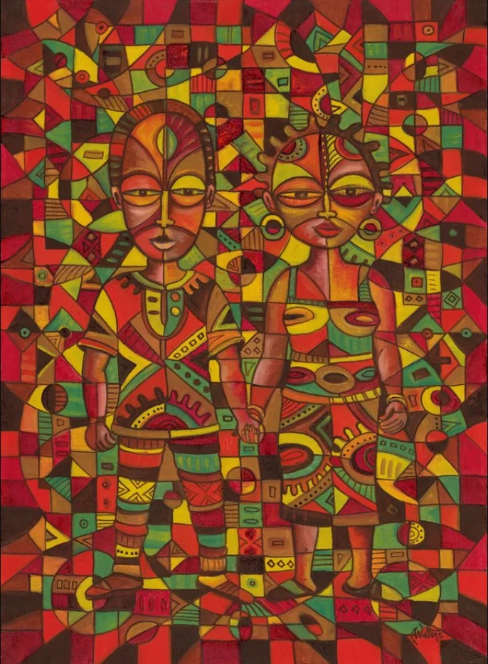
Artists use color as a way of evoking emotions in their work. The use of vibrant colors has an energizing effect, while the use of muted neutrals can create a soothing effect. Keeping color psychology in mind when selecting art can help you use color to set the tone in a space. Exploring how color can affect your mood can help you decide what hues you’d like your art to feature. The art you feature in your bedroom will be different from the art in your office, and your selection will be affected in part by the colors used in the artwork.
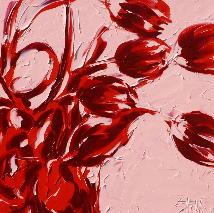
Red Art
Red is a color associated with both affection and aggression. Bright reds can be used to create a fiery, intense feeling and is often used by sports teams to help create a motivating and energizing mood. When red is paired with complimentary colors, it can create a passionate, loving feeling. It is often used in association with romance, a great example being the red rose as a ubiquitous symbol for love.
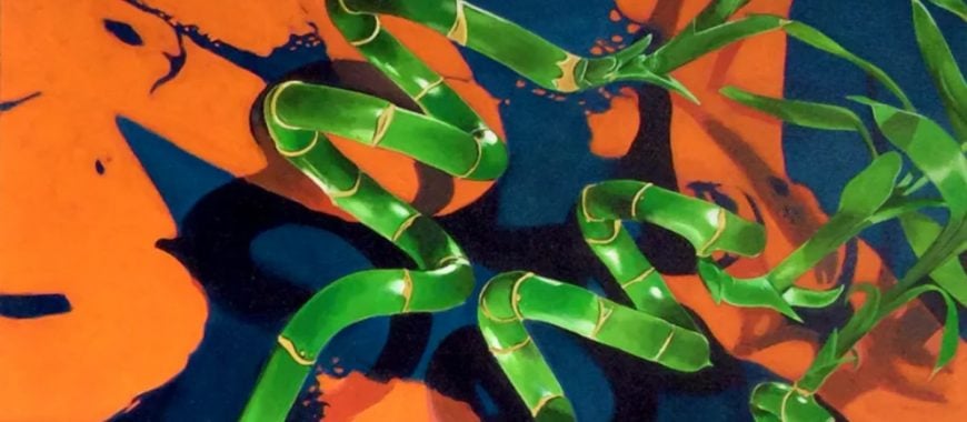
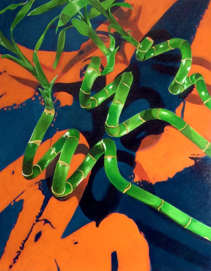
Orange Art
Orange is used to evoke a feeling of energy or extravagance. Orange is a vibrant color that instils a sense of vitality and enthusiasm. It can have an invigorating effect and add life to any space. It can also be used to attract the viewer’s attention, which is why it’s used for safety equipment and hazard signs.
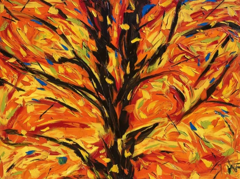
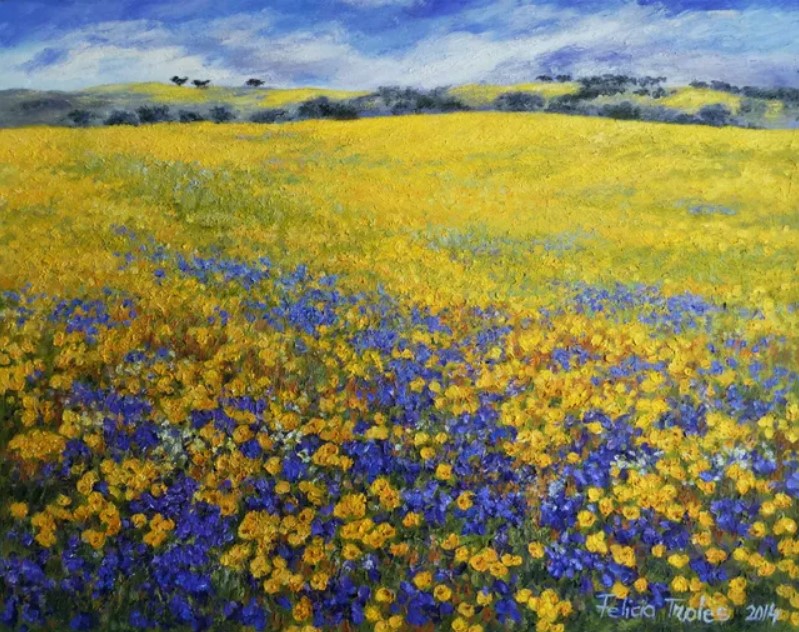
Yellow Art
Yellow is often used as a cheerful color meant to bring a sense of sunshine, warmth and happiness. It has an upbeat and bright association but can also be used to draw attention like orange. The vibrancy of yellow naturally lends itself to calling out important matters which is why you see it on street signs or warning labels.
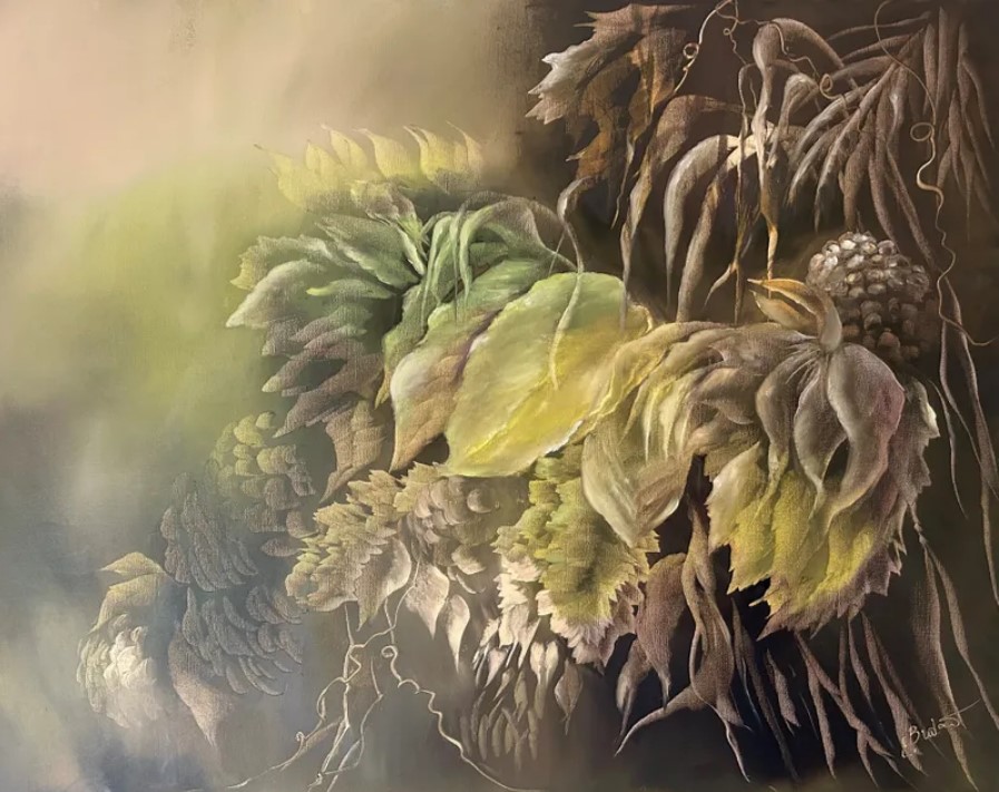
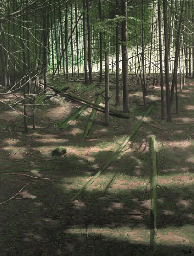
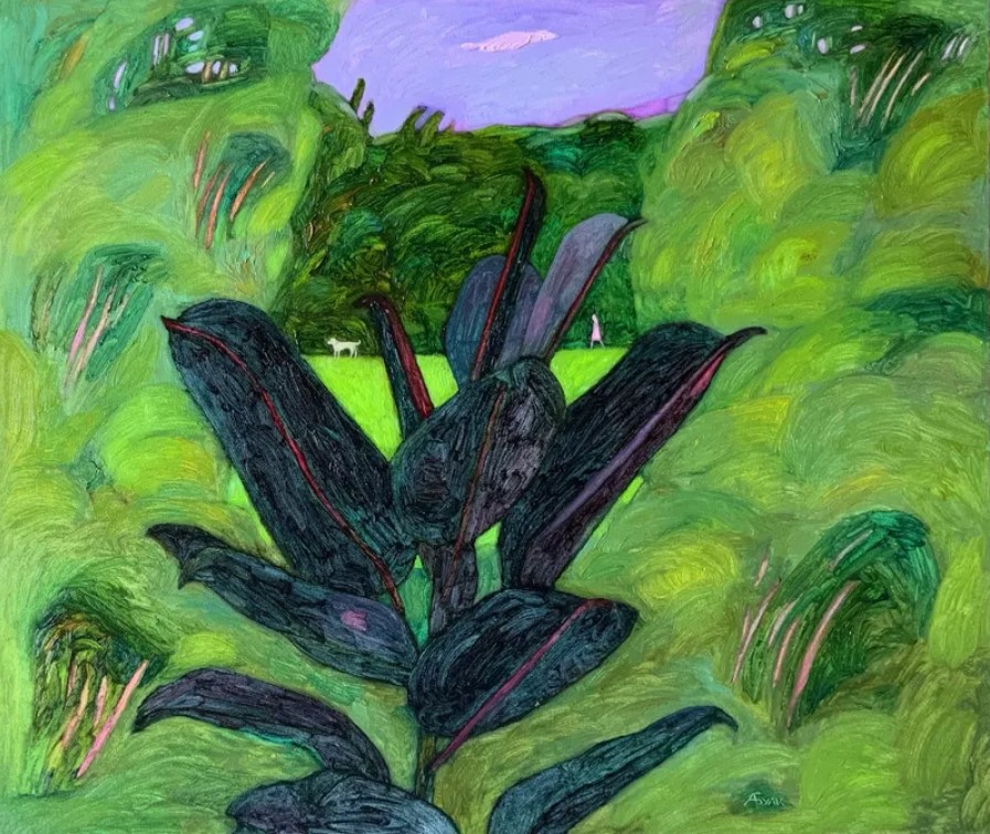
Green Art
Green is a highly versatile color which has a variety of associations. Green is the color of nature and has a grounding, calming effect. It is used to relieve stress and create a sense of tranquility and stillness. Green is also associated with prosperity and success. Certain tones of dark green have a luxuriousness to them and bring to mind wealth and money.
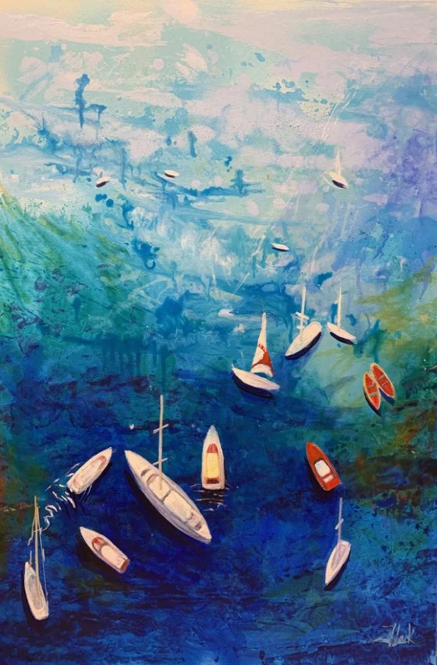
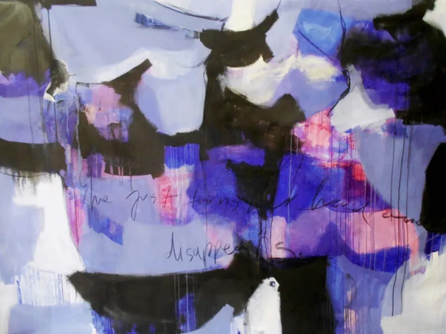
Blue Art
Blue has many associations from the ocean to the sky, and to tranquility and sorrow. The mood created by the use of blue varies depending on the shade of blue. Darker blues can evoke a sense of sorrow and sadness, while a lighter blue can have a calming and soothing effect. Blue is a great example of a versatile color that can be used in different shades and combinations to create a variety of emotions.
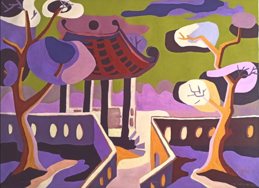
Purple Art
Purple has long been known as the color of royalty due to the fact that purple dye was extremely scarce and expensive in ancient times. It is used to create a sense of richness and extravagance. Lighter tones of purple like lavender can also have a calming effect and create a restful atmosphere.
Shop Art in Every Color on Zatista
By knowing more about color psychology, you can harness the power of art to create an intentional atmosphere in any space. Our online art gallery contains thousands of original art pieces in every color of the rainbow. Shop artwork from emerging and established artists from around the globe at Zatista.com.
Comments (0)