
Basic color theory is useful to consider when picking colors to decorate your home.
In the 19th Century, the Impressionists (a group of artists including Claude Monet, Pierre-Auguste Renoir and Edgar Degas) studied the science of color theory and applied it to their paintings. Specifically they noted that when complimentary colors are placed next to each other, the individual colors become more vibrant. Complimentary colors are directly opposite each other on the color wheel.
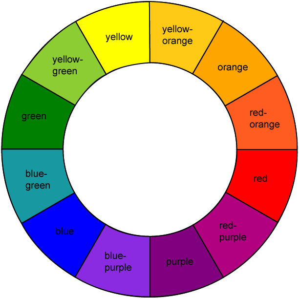
color wheel
Here in one of his famous sunrise works, Monet takes advantage of the complementary colors Blue and Orange to make this painting glow. The orange sun shines much more intensely surrounded by a patch of blue sky.
Impression, Sunrise 2 by Claude Oscar Monet
This works for all complementary combinations, with any imaginable shade or hue.
Blue/Orange:
The contrast of the vivid red-orange poppies and the soft blue sky makes each color pop and creates a visually stunning work.

Poppy Passion by Carole McClintock on Zatista.com
The striking combination of brilliant sea blue-green with rich earthy orange draws the eye into this piece.

Sailing the Blue by Janice Schoultz Mudd on Zatistsa.com
The soothing mix of dark midnight blue with bright yellow-orange adds visual interest and flow to this dream-like image.

Sleep 1 by Valerie Vescovi on Zatista.com
Yellow/ Purple:
Nature utilizes complimentary colors well, as illustrated in this simple, stunning photograph.

#45 by Beth Bloom on Zatista.com
The thick brushstrokes and golden background help make the purple eggplants come to life.

Eggplants by Stephanie Berry on Zatista.com
The dark purple rust tones make the splash of yellow pop in this abstract-like photograph.

Grape Crush by Vanessa Prestage on Zatista.com
Red/Green:
The soft mossy green colliding with the surge of dark crimson make this a visually appealing work.

Overgrown With Moss by Lisa Carney on Zatista.com
The bright lime green background creates the perfect backdrop for each vibrant ruby leaf.

Dreaming Tree – (green w/red) by Michelle Han on Zatista.com
The dark olive tones contrasted with the fiery red set this work aglow.

Believers In Red by Katina Desmond on Zatista.com
Regarding bathroom art:
I love bathroom art. I just hung an over sized piece of work in my teeny little bathroom and it’s bright colors and shapes make me happy to be in that space Everyone spends a fair amount of time in a bathroom, so why not?
I do hang acrylic on canvas work due to moisture content with showers etc vs. works on paper with mats and frames. I am happy to use and sell bathroom art!